This was the stage that the initial prototype was at. It was a cube shape, see through and plastic. Tests were conducted to see the result that spray painting would look like on them. Various other methods were tried as well, like using see through paper and white removable spray but proved to be ineffective.
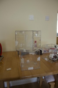
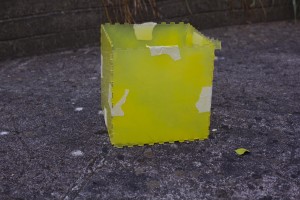
Spray painting testing was done to make the object semi transparent so the viewer would be able to see into the box but not clearly. When the project moved in the direction of mental health this box deemed to be unsuitable for a number of reasons. It was difficult to make it visually look good by spray painting it and also to properly see the lights that we wanted to use. The size of the technology used was far to small for the box so a smaller object was needed.
A rethink of the design was needed to make it relate to the idea of mental health. A more customisable design was needed, smaller in size and something that relates to Pieta House. The solution that we both came up with for this was a timber frame that could be made look like a light that can be placed on a desk. It would give us the ability to fully customise the colour. It also allowed us to put a semi transparent cover on the front and back, which is the finish result we were looking for in the original prototype.
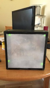
The physical object as a light is a good metaphor for the human condition. A human light can shine bright if feelings are happy or distinguish if the end of the road occurs. Green was used as the colour for the Twitter feed notifications as May is mental health awareness month. As part of that month a green ribbon is being sold to raise awareness of mental health in Ireland.
We also thought having two objects might be an interesting way to show the disparity that exist between topics being talked about in public. One of the objects could be a generic colour while the other is a colour that links it to Pieta House and the poster. It has yet to be decided if two objects will add confusion to the display. We will need to conduct user testing to get information about this.
I am currently in the process of user testing using this video. The reports are currently inconclusive. Conducting the research using the video seems to leave more questions for the user, so the next step would be to conduct the testing where users are in the same room as device to see if there is a similar issue.
Information was provided on why we were conducting the research and an explanation about the project.
Questions asked:
- Do you think it will create debate among people if it was in a public space?
- Do you associate green with any positive mental health awareness campaign? If so which one?
- What does it make you feel, if anything?
- What do you like about our idea?
- What do you dislike about it?
Results gathered so far:
- Don’t think it will create debate… I do think it will highlight how many people actually use that hashtag
- not sure
- Curious
- its a live visual representation
- What does it actually mean, why is it to the edges
- Why that pattern?