In order to represent the self harm statistics which I recived off of Micheal I wrote an Arduino script that handles the data and calculates how long and often the light should be on represented within an hour.
here is that script: self harm.zip
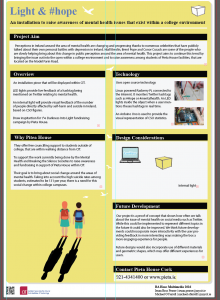
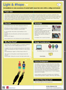
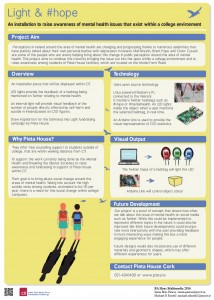
Brús Pearse & Michael O' Farrell
In order to represent the self harm statistics which I recived off of Micheal I wrote an Arduino script that handles the data and calculates how long and often the light should be on represented within an hour.
here is that script: self harm.zip
This research, was based on the idea of doing a random act of kindness for a stranger. We had decided to concentrate the location of the project within CIT, so the research was carried out there. Inside the wrapped packages is a bar of chocolate with a USB. I handed them out the to random students and asked them to complete the survey that was included in the document.
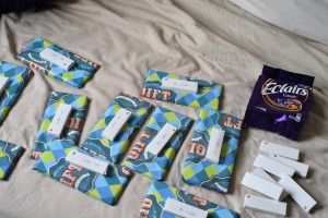
Document that was included in the USB
Here is a link to the survey I asked them to fill out. In total I handed out 10 items and got a response back from 23 students. The results of this be viewed here.
The high number of responses gathered indicated that students supported the idea that being kind to a stranger has positive implications to ones mental well being. I can attest that by handing them out has positive benefits for me. Because of this research, it brought attention to the issue of students mental health, something we had not considered before for our project. In order to pursue this further I contacted the two societies that are involved with student health, the CIT Mental Health Socieity and Breaking the Silence.
What struck me at first was why were there two separate societies for the same issue. I had never heard of the Mental Health socieity before even though it was set up for about a year. Both societies are in effect doing the same work, promoting positive mental health amongst students. A quote that struck me from Joe Crowley, the student who established the CIT Mental Health socieity, was that it was “impossible to start a debate around the area of mental health”. That is something that he is trying to pursue in CIT by going a very direct route and asking students to volunteer to make a video where they state their name and say they have struggled with mental health in the past. Here is a link to that idea. It is a tall order to ask of students to publicly undertake something like that. While I agree with it in principle, it has the potential to cause problems for students as well. I asked him if many students got involved in this idea and he said there wasn’t. This could also be down to the fact it was not advertised that much so it does not give any real definitive information on the issue apart from the fact that the socieity is struggling to come up with a way to create a debate around the issue of mental health.
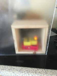
This was the stage that the initial prototype was at. It was a cube shape, see through and plastic. Tests were conducted to see the result that spray painting would look like on them. Various other methods were tried as well, like using see through paper and white removable spray but proved to be ineffective.
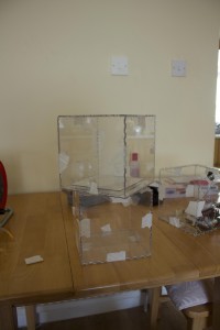
Spray painting testing was done to make the object semi transparent so the viewer would be able to see into the box but not clearly. When the project moved in the direction of mental health this box deemed to be unsuitable for a number of reasons. It was difficult to make it visually look good by spray painting it and also to properly see the lights that we wanted to use. The size of the technology used was far to small for the box so a smaller object was needed.
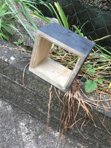
A rethink of the design was needed to make it relate to the idea of mental health. A more customisable design was needed, smaller in size and something that relates to Pieta House. The solution that we both came up with for this was a timber frame that could be made look like a light that can be placed on a desk. It would give us the ability to fully customise the colour. It also allowed us to put a semi transparent cover on the front and back, which is the finish result we were looking for in the original prototype.
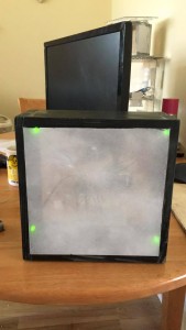
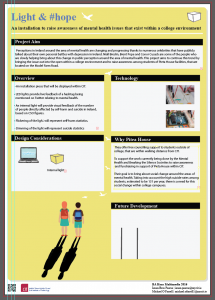
The physical object as a light is a good metaphor for the human condition. A human light can shine bright if feelings are happy or distinguish if the end of the road occurs. Green was used as the colour for the Twitter feed notifications as May is mental health awareness month. As part of that month a green ribbon is being sold to raise awareness of mental health in Ireland.
We also thought having two objects might be an interesting way to show the disparity that exist between topics being talked about in public. One of the objects could be a generic colour while the other is a colour that links it to Pieta House and the poster. It has yet to be decided if two objects will add confusion to the display. We will need to conduct user testing to get information about this.
I am currently in the process of user testing using this video. The reports are currently inconclusive. Conducting the research using the video seems to leave more questions for the user, so the next step would be to conduct the testing where users are in the same room as device to see if there is a similar issue.
Information was provided on why we were conducting the research and an explanation about the project.
Questions asked:
Results gathered so far:
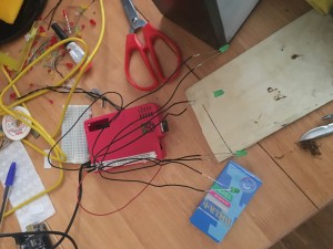
For our device I did research into the materials we used and explored what we can do with the materials we had chosen wood & acrylic.
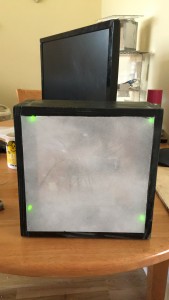
Once we were happy with what we would do with the final look and feel I set out building the devices.
.
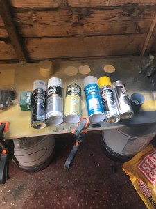
I used a spare material to from another project to set up a bench in my garden shed so I could have an are to spray paint.
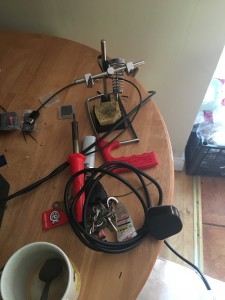
While building the device I had to solder a number of things and spent a good bit of time soldering wires onto LEDs . I had not done this in a while and had to practice a few times to get it right.
One of the Raspberry Pi computers with the GPIO pins connected to the LEDs that I used.
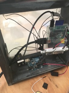
What inside the device looks like.
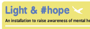
Here is the visual progress of the design of the poster. I started off with what Maria suggested in the workshop and used Nate Williams – formula for ideas as a starting point. This is where the ideas of the graphics came from. They are a little all over the place at this point but it was just a way to work through what I wanted.
It was this poster that gave me the idea of using shadow as a means to get across the idea of depression.
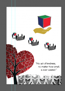
At this stage of the project the name was not yet definite so I just used the lettering of random acts of kindness as a guide.
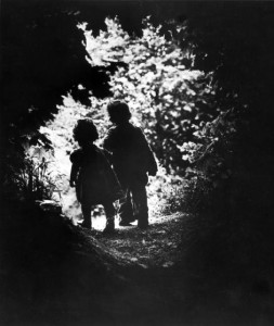
I started thinking of what image would be best suited to convey the notion of mental health and how it it could be a positive image as well. This photograph of W.E Smith sprang to mind as it was the first one he took after he was nearly killed while photographing a war. He wanted it to be positive and life affirming and to rekindle his love of photography again.
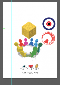
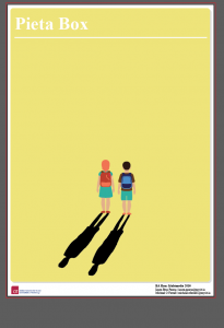
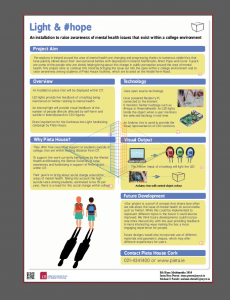
There was a strong possibility Pieta House were going to say yes to our proposal so I redesigned the poster again. Combining elements of the above two ideas I came up with this design. The yellow is a reference to the Darkness Into Light yellow colour that Pieta house but it not as bright. A muted colour makes it more serious in tone than the bright yellow they use.
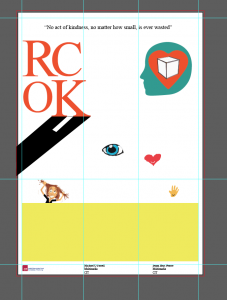
To build on that I mapped out boxes that I thought could be used like this.
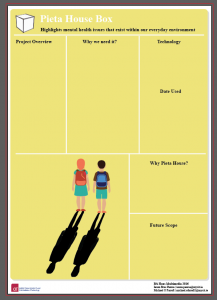
They proved to be impractical. So I started with one box in the top for the project aim and tried to have identical sized boxes underneath for uniformity.
It was from this image I got the idea of the birds. I thought they would be a good way to show hope and visually catch the attention of the viewer by having them rise in size up to the top of the page.
It was at this point that I sent it to Angela Horgan to see if she would have any issues with the text or images. Because we are naming Pieta House on the poster it was imperative that they gave the agreed with the design of the poster. Through email, I kept Angela updated with the visual design. She agreed on all the aspects of the poster and said that the poster gave her a better understanding of the finished item.
To reduce the harshness of the boxes I put rounded edges on them to make it look less severe. I reduced the opacity on both the white box and the text for the same reason. I also changed the font to give it more of a serious look, which I felt it needed. After using various different fonts I settled for Bpreplay, as I felt it conveyed the message we wanted to get across in a straight forward manner.
The text was all wrong in the version above after changing the font. Here it is fixed up. I changed the black boxes to the same blue used on the name. It gives a softer look and adds more uniformity to the look. I also used the bird in the top right as a logo instead of the box. It makes it look much cleaner and leaves an air of positivity to the design.
![]() Blue is the colour of the intellect, the mind, making it the colour of communication and when you think about social media, it’s all about communicating.
Blue is the colour of the intellect, the mind, making it the colour of communication and when you think about social media, it’s all about communicating.
Blue also has the perception as being trustworthy, dependable, safe and reliable. These are the perceived positive qualities of a business who chooses blue.
Because our project is using a Twitter feed I started looking at the colour physiology of the colour blue. It is used in the logos of all the major social media platforms. This is not to suggest that our object will be a social media platform, but rather to draw the meaning from the colour and use it to reinforce our idea. The particular shade of blue was not a direct colour associated with any of the big social media companies but would be closest to Facebook. However, I don’t think this is apparent when only viewing it as text.

I wanted a light font as well to visually match the word “light”. This reinforces the meaning and visually carries a meaning of purity without being to heavy handed about it.
If you contrast the one above with this image the meaning is different. I nearly settled for this font but the weight of the font is much to heavy for the message that is being conveyed. It visually contradicts itself so I choose not to pick this version.
Yellow
This color relates to acquired knowledge. It is the color which resonates with the left or logic side of the brain stimulating our mental faculties and creating mental agility and perception.
Being the lightest hue of the spectrum, the color psychology of yellow is uplifting and illuminating, offering hope, happiness, cheerfulness and fun.
Yellow of course is the colour that Pieta House use in their Darkness Into Light campaign. That yellow is much to bright for the poster as I fear it could potentially saturate the poster to the point that it will be unreadable. For that reason I used a more muted tone. I also tried changing around the image and use white instead of the yellow but it didn’t look as good and was more unlike something Pieta House would use.
We also did a user test on the new object that we had and found that by using yellow the end result was just to bright. We decided to go with a mixture between the yellow and the white as it was a good compromise to get the result that we wanted.
While researching sensors I explored using the following sensors.
Motion sensors, knock sensors, GPS sensor, compass sensor and accelerometer.
I was able to get all the sensors working except for the GPS Sensor.
here is a zip of the arduino sketches I used.
In our device a Raspberry Pi is used to comunicate with Twitter in order to do this i had to learn about python.
I followed this guide to get the basic code working. I then added code to get the speaker to work. This took some time as I had to figure out how to send the correct signal to the raspberry pi . I used this guide to send the correct signal to the pi.
While i have used a Raspberry Pi in the past i have never used the GPIO pins one and I did not know python so this part of the project was a learning experience for me.
tweet2.py is a zip file containing the code I used for that part of the project.
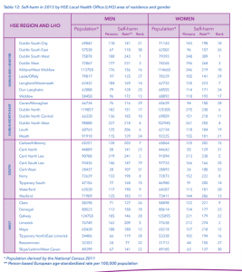
This is a good article I found about some facts and figures relating to suicide in Ireland.
The most alarming statistic out of that is “Cork has the highest level of suicide amongst Ireland’s main cities with a rate of 18 deaths per 100,000 people. This places it well above the national average of 12 deaths per 100,000 people”. That article was written on April 13, this year but it does not clarify what year the data is from.
There is also a video link in the clip to the video that the Mental Health socieity were trying to get students involved in. Our Mental Health they are called and are based in UCC.
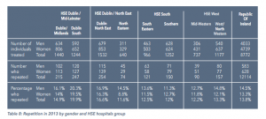
We also needed information for the self harm data. NRSF has an excellent report on the current figures for the past few years. To keep the figures low and to keep in in the same geographical location we we thinking of using data for the south of Ireland, in 2013. These would be the latest figures available. These are two possible data sets that could be used.

This is a photograph taken by W. Eugene Smith after a two year break from photography after nearly getting killed in 1945 while photographing war conditions in Okinawa. He barely recovered and there was a possibility he might never photograph again due to physical problems but also because of a long “creative exile” from taking photographs. He felt it was important that the first image he takes “would speak of a gentle moment of spirited purity in contrast to the depraved savagery I had raged against with my war photographs”.
Overcoming the physical challenges that his injuries caused, this is the first photograph he took. It speaks of personal determination to overcome personal obstacles and is a fitting image to base the poster on when you consider the personal challenges involved in mental health.
I really enjoy this guys movie posters. He makes great illustrations using relatively simple design based on shapes and elements of the movies to get across the theme of the movie. He conveys movement with beautiful curved shapes that add depth to the image. I tried to incorporate this style into the final design of the poster. Simple graphics that get across the message in an effective manner.
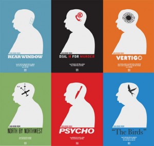
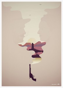
Thats is a link to his Instagram account. It is more easily accessible than his website which is pretty dated at this stage. This is something that might be considered in the design of the object. He uses crayons but could tubes be uses to brand the front of the object that light up a section when light? Or convey a positive message like #hope?