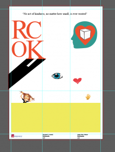
Here is the visual progress of the design of the poster. I started off with what Maria suggested in the workshop and used Nate Williams – formula for ideas as a starting point. This is where the ideas of the graphics came from. They are a little all over the place at this point but it was just a way to work through what I wanted.
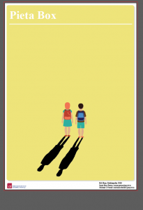
It was this poster that gave me the idea of using shadow as a means to get across the idea of depression.
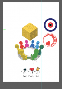
At this stage of the project the name was not yet definite so I just used the lettering of random acts of kindness as a guide.
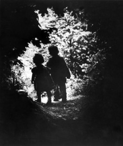
I started thinking of what image would be best suited to convey the notion of mental health and how it it could be a positive image as well. This photograph of W.E Smith sprang to mind as it was the first one he took after he was nearly killed while photographing a war. He wanted it to be positive and life affirming and to rekindle his love of photography again.
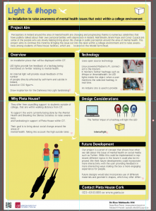
There was a strong possibility Pieta House were going to say yes to our proposal so I redesigned the poster again. Combining elements of the above two ideas I came up with this design. The yellow is a reference to the Darkness Into Light yellow colour that Pieta house but it not as bright. A muted colour makes it more serious in tone than the bright yellow they use.
To build on that I mapped out boxes that I thought could be used like this.
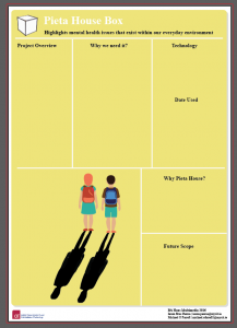
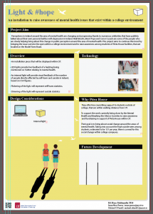
They proved to be impractical. So I started with one box in the top for the project aim and tried to have identical sized boxes underneath for uniformity.
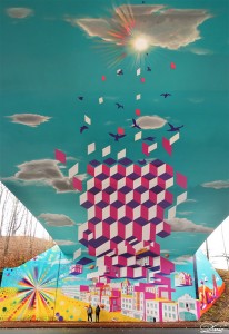
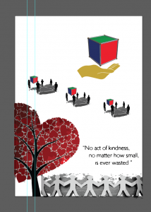
It was from this image I got the idea of the birds. I thought they would be a good way to show hope and visually catch the attention of the viewer by having them rise in size up to the top of the page.
It was at this point that I sent it to Angela Horgan to see if she would have any issues with the text or images. Because we are naming Pieta House on the poster it was imperative that they gave the agreed with the design of the poster. Through email, I kept Angela updated with the visual design. She agreed on all the aspects of the poster and said that the poster gave her a better understanding of the finished item.
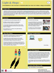
To reduce the harshness of the boxes I put rounded edges on them to make it look less severe. I reduced the opacity on both the white box and the text for the same reason. I also changed the font to give it more of a serious look, which I felt it needed. After using various different fonts I settled for Bpreplay, as I felt it conveyed the message we wanted to get across in a straight forward manner.
The text was all wrong in the version above after changing the font. Here it is fixed up. I changed the black boxes to the same blue used on the name. It gives a softer look and adds more uniformity to the look. I also used the bird in the top right as a logo instead of the box. It makes it look much cleaner and leaves an air of positivity to the design.